
← Back To Blog
7 Performance Dashboard Examples to Steal in 2026
Drowning in spreadsheets, disconnected exports, and half-updated charts? That's a common starting point. The problem usually isn't a lack of data. It's that the data sits in too many places, updates too slowly, or answers the wrong question when someone needs to make a decision fast.
A good dashboard fixes that. It turns raw activity into a clear operating view, with the right KPIs, the right comparisons, and enough context to tell you whether something needs action now or just monitoring. If you're building one, it helps to start with proven KPIs for your marketing dashboard, then shape the layout around the decisions your team makes.
These performance dashboard examples go beyond screenshots. Each one shows a different strategic blueprint. Why the layout works, which metrics belong on it, and which mistake usually ruins it.
1. The Upwork Analytics Dashboard
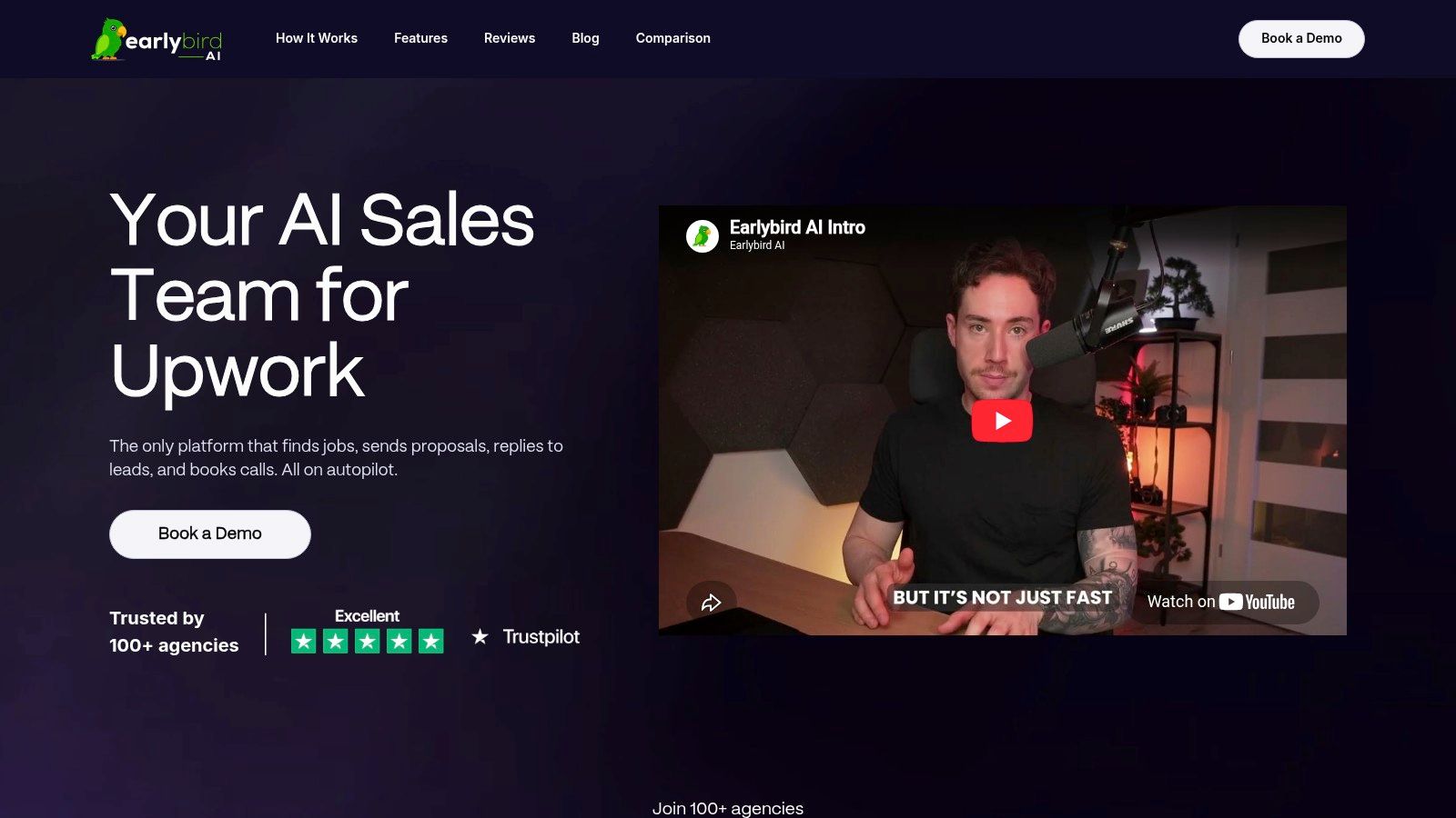
Most general BI tools fall apart the moment you try to use them for Upwork. They can chart activity, but they usually can't reflect the actual sales motion on the platform. Proposal timing, reply speed, interview flow, won deals, and follow-up behavior all matter. That's why Earlybird AI stands out among performance dashboard examples. It's built around the actual Upwork funnel, not a generic lead pipeline.
You can explore the platform at Earlybird AI. The key difference is that the dashboard isn't isolated from execution. It sits inside a system that finds jobs, drafts customized proposals, replies to client messages, follows up, and helps book calls. That creates a cleaner feedback loop than a dashboard that only reports after the fact.
Why the layout works
A strong Upwork dashboard should answer four questions fast. Are we bidding on the right jobs? Are clients responding? Are conversations moving? Are wins turning into revenue?
Earlybird AI is built around those operational questions. That matters because most dashboard guides still fail to connect visible metrics to actual decisions. Only 12% of reviewed dashboard guides include discussion questions or interpretation guidance, which is exactly why so many teams stare at charts and still don't know what to change.
Practical rule: If a dashboard can't tell a bidder whether to change targeting, proposal style, response handling, or follow-up cadence, it's reporting, not managing.
Essential metrics for this function
For Upwork sales, the best metrics aren't vanity numbers like raw proposal volume. The useful view is funnel-based.
- Proposal performance: Track proposals sent, replies, interviews, wins, and time-to-close so bidding activity connects to actual outcomes.
- Speed metrics: Response timing matters on marketplaces. Earlybird's operating model emphasizes proposals submitted in about ten minutes and replies in under five minutes, which is useful because speed often changes who gets seen first.
- Revenue linkage: Won contracts should sit near the activities that created them. Otherwise, teams optimize for reply rate and miss profitability.
- Profile health context: If conversion is weak, the problem may be positioning rather than outreach. That's where understanding your Upwork Job Success Score becomes part of dashboard interpretation, not a separate exercise.
The platform also supports multi-user agency workflows, profile optimization, real-time analytics, and account-safety measures such as human-like behavior, regional IPs, and no password storage. That makes it more practical for agencies than a one-user bidding assistant.
The trade-off most buyers miss
This isn't the right fit if you only want a cheap reporting layer. Earlybird AI is an execution system with analytics attached, so value depends on setup quality, profile strength, and job targeting discipline. There's also no published pricing, and several testimonials describe it as a high-ticket product. That means the ROI question is simple. If the platform helps you land enough qualified work, it justifies itself. If your positioning is weak, automation will expose that faster, not hide it.
A niche dashboard wins when it accurately reflects the operating environment. For Upwork, that's the entire point.
2. The Live TV & Team Motivation Dashboard

It's 10:17 a.m. The support queue is climbing, two reps are stuck on escalations, and nobody notices until response times slip hard enough for a customer to complain. A wallboard solves that specific problem. It keeps the team's operating condition visible all day, without asking anyone to open a report.
Geckoboard does this well. Its dashboard gallery shows the pattern clearly: oversized headline metrics, limited chart types, and layouts built for office TVs, Slack, email, and phones. That format works for sales teams, service desks, and agency delivery pods because it favors fast recognition over detailed analysis.
Why the layout works
A live team dashboard should answer one question in a few seconds: are we on pace, or do we need to intervene?
That sounds simple, but teams miss it all the time. They treat a TV dashboard like a mini BI tool, then pack it with filters, tiny charts, and metrics nobody can act on mid-shift. The better blueprint is narrower. Put the current-state numbers at the top, add one short trend view for context, and reserve alerts for exceptions that need a response now.
For service teams, a useful wallboard usually includes:
- Queue pressure: Open tickets, unassigned tickets, backlog by priority
- Speed metrics: First response time, full resolution time, SLA risk
- Capacity signals: Agent status, active chats, escalations, handoffs
- Alert logic: Clear thresholds that change color when service levels are at risk
For sales teams, the layout changes because the behavior you want is different:
- Daily pacing: Calls, meetings booked, demos held, revenue against target
- Leaderboard metrics: Rep ranking, quota progress, conversion by stage
- Pipeline visibility: New opportunities, stalled deals, close-date risk
Agency teams can use the same model for delivery and reporting operations. A live board for campaign execution, content production, or client comms works best when it tracks throughput, deadlines, blockers, and overdue items. Teams building client reporting systems often find the same discipline useful in their SEO agency reporting process. The screen should show what needs attention now, not every metric available in the stack.
The pitfall to avoid
Motivation dashboards go bad when they become public scoreboards with no operational context.
I've seen this happen on both sales and support teams. A leaderboard can create urgency, but it can also push the wrong behavior if the screen only shows outputs. Reps start chasing easy wins, support agents rush tickets, and managers spend the afternoon explaining why the numbers looked good while customer experience got worse.
The fix is straightforward. Pair performance metrics with guardrails. If you show tickets closed, show CSAT or reopen rate nearby. If you show meetings booked, show show-rate or qualified pipeline next to it. Wallboards shape behavior, so the metric design has to be intentional.
A team TV dashboard should be readable from across the room. If someone has to click, decode, or squint, it belongs in a different reporting layer.
That is why this category matters. It is less about analysis and more about shared awareness, pace control, and visible accountability. Used well, it helps teams react faster. Used badly, it turns into office wallpaper.
3. The Client-Ready Marketing & Sales Dashboard

A client opens the monthly report five minutes before your call. If the dashboard is doing its job, they should understand performance before you start explaining it.
That is why Databox works well in this category. Its library of Databox marketing dashboard examples is built for reporting conversations, not just internal analysis. Agencies can get to a usable first draft fast, then shape it around the client's goals, buying cycle, and reporting maturity.
Why this layout works
The best client-facing marketing and sales dashboards follow a simple reading path. Start with business outcomes. Then show where those outcomes came from. End with the campaign or channel detail needed to diagnose a problem.
That sounds obvious, but a lot of agency reports still do the reverse. They open with click-through rate, impressions, and ad set breakdowns before the client has seen leads, pipeline, or revenue impact. The result is a polished report that answers the wrong question.
For this type of dashboard, the structure should usually look like this:
- Top row: Target, actuals, pacing, and period-over-period change
- Middle section: Lead volume, conversion rates, pipeline creation, and source mix
- Bottom section: Campaign, keyword, ad, or landing page detail for investigation
This format holds up well across paid media, SEO, lifecycle, and outbound-assisted reporting because it mirrors how clients evaluate performance. First, did we hit the goal. Second, where did the result come from. Third, what needs to change.
Teams building this kind of reporting stack often pair the dashboard with the rest of their digital marketing agency software stack, so CRM data, ad data, and client delivery workflows stay connected.
Metrics worth including
A client-ready dashboard should earn every tile. Good marketing reports connect activity to commercial impact, so the metric set needs to show progression across the funnel rather than dumping channel data on one page.
For a combined marketing and sales view, the strongest candidates are:
- Spend and budget pacing
- Leads or MQLs
- Cost per lead or cost per MQL
- SQLs or qualified opportunities
- Pipeline value created
- Lead-to-opportunity conversion rate
- Opportunity-to-close rate
- Forecast coverage or booked revenue
Not every client needs all of them. A startup running demand generation may care more about lead quality and sales acceptance. A mature B2B account with a long sales cycle may need pipeline creation and stage velocity to sit closer to the top. The trade-off is always the same. The more metrics you add, the more likely the main story gets buried.
The pitfall to avoid
The common failure is reporting platform convenience instead of decision value.
Databox makes it easy to pull in data from everywhere. That is useful operationally and dangerous editorially. Once teams start adding every ad metric, CRM property, and website event available, the dashboard stops being client-ready and turns into a data warehouse with better colors.
Keep the screen tight. Show the numbers that connect spend to leads, leads to pipeline, and pipeline to revenue. Leave the diagnostic detail available for the people who need it, but do not force every client to sort through it.
Templates help. Editing is what makes them work.
4. The Customizable Agency Operations Dashboard

Klipfolio is what many teams move to after they outgrow simpler templates. Its example hub at Klipfolio dashboard examples shows why. The platform gives you more control over metrics, calculations, and visual logic than lighter tools, which is exactly what operations-heavy agencies need.
You build dashboards for delivery, resource planning, finance, and cross-functional management. Not just marketing snapshots.
Why operations dashboards need more structure
Operational dashboards fail when they only show current status. Leaders need context over time. A valid performance dashboard should include monthly time series going back at least two years so teams can spot seasonality, detect meaningful shifts, and separate noise from trend, according to this guidance on dashboard design requirements for better decisions.
That principle is especially important in agency operations because utilization, retention, project margins, and client demand all fluctuate. If you only look at the last month or quarter, you can misread a normal dip as a crisis or miss a slow decline.
Metrics worth building for
Klipfolio is a strong fit when you need custom views such as:
- Project profitability: Revenue by client or service line against delivery cost.
- Resource utilization: Capacity, billable allocation, and workload balance.
- Retention signals: Churn risk, renewal timing, and account health.
- Leadership rollups: Pacing against quarterly and yearly targets.
It's also a solid companion to a broader stack of software for a digital marketing agency, especially when data lives across finance, CRM, PM, and marketing systems.
Field note: Flexible dashboard tools reward teams that already know their operating model. If you're still arguing about KPI definitions, extra customization will slow you down.
The main trade-off
Klipfolio gives you power, but it expects more from the builder. If your team wants something anyone can launch in an afternoon, this isn't the easiest path. If you need custom operations reporting with stronger control over data logic, it's often worth the extra setup.
5. The Google Ecosystem Performance Dashboard
A familiar scene in marketing teams. GA4 says traffic is up, Google Ads says spend is under control, Search Console shows impressions climbing, and leadership still asks the same question: are we getting more efficient or just busier?
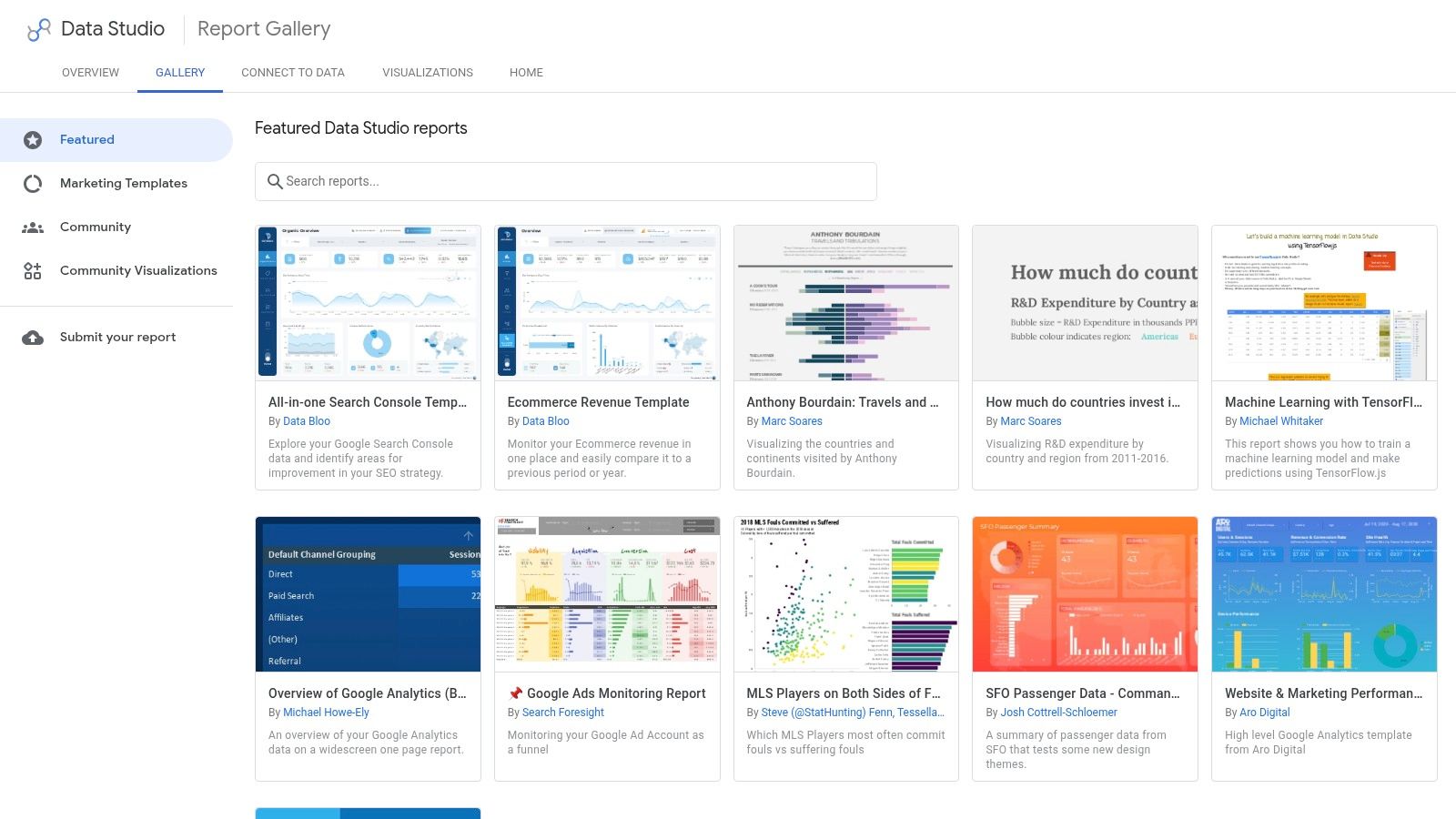
That is why Looker Studio earns its place on this list. If your team already works inside GA4, Google Ads, Search Console, and BigQuery, the Looker Studio gallery gives you a fast way to turn scattered channel data into one operating view. The value is not the template itself. The value is getting the Google stack into a single layout that answers the same business questions every week.
Why this layout works
The best Google ecosystem dashboards follow a simple hierarchy. Put the top-line outcomes first, then the traffic and conversion trends behind them, then the channel and campaign tables where managers diagnose the cause.
For this setup, I like a three-layer structure. Start with revenue, leads, ROAS, cost per conversion, and conversion rate. Follow that with trend charts for sessions, spend, branded versus non-branded search, and assisted conversions. Finish with drill-down tables for campaigns, landing pages, search queries, device mix, and geo performance.
That order matters.
Executives can get the headline in a few seconds. Channel owners can keep scrolling and find the reason performance moved without opening three different platforms.
Metrics worth including
A strong Google-focused dashboard usually works best when it includes:
- Business outcomes: Revenue, qualified leads, pipeline contribution, or purchases
- Efficiency metrics: Cost per lead, cost per acquisition, ROAS, and conversion rate
- Search visibility: Impressions, clicks, CTR, average position, and branded versus non-branded query trends
- Site behavior: Landing page engagement, bounce trends where relevant, and assisted conversion paths
- Media control metrics: Spend pacing, impression share, campaign-level waste, and audience performance
If leadership wants a single health indicator, use a blended efficiency score built from the inputs your team already trusts. Google's own Looker Studio marketing templates show the broader pattern well: combine cost, conversion, and outcome data into one summary view, then let users click into the underlying drivers. A single score is useful for triage. It becomes dangerous when teams cannot explain what moved it.
The trade-off to respect
Looker Studio is fast, familiar, and cheap to test. It also makes it easy to publish a dashboard that looks finished before the KPI logic is settled.
That is the trap.
Teams often add every available chart because the connectors make it easy. The result is a long report with weak hierarchy, too many filters, and no clear answer to what changed, where it changed, and whether anyone should act on it. A better build is narrower. Pick the few decisions the dashboard needs to support, define the metric logic first, then design the layout around those decisions.
6. The Data Storytelling & Inspiration Dashboard
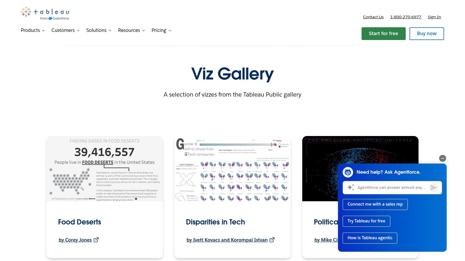
Not every dashboard example should be copied directly. Some should challenge how you think. That's where Tableau Public's Viz Gallery is useful. It's less a production reporting library and more a design laboratory.
When teams get stuck building the same KPI grid over and over, this is often the fastest way to break the pattern.
What Tableau Public is best for
The strongest Tableau Public dashboards show how narrative, hierarchy, and interaction can make complex information easier to absorb. That matters when your audience doesn't just need monitoring. They need to understand why a pattern exists.
Emerging dashboard content in 2025 and 2026 has largely ignored AI-driven anomaly detection, even though 40% of high-performing marketing and sales teams are using AI to flag unusual patterns in real-time dashboards. Tableau's surrounding ecosystem is one of the places where that design direction starts to feel real, especially when dashboards move from static visuals to guided exploration.
The best inspiration galleries don't just show prettier charts. They show better questions.
What to steal, and what not to
Steal the information hierarchy. Steal the use of visual contrast. Steal the way strong dashboards guide attention from headline insight to supporting evidence.
Don't steal complexity for its own sake. Tableau Public examples can tempt teams into building dashboards that impress analysts and confuse everyone else. Use the gallery to improve storytelling, not to decorate mediocre KPIs.
7. The Enterprise & BI Integration Dashboard
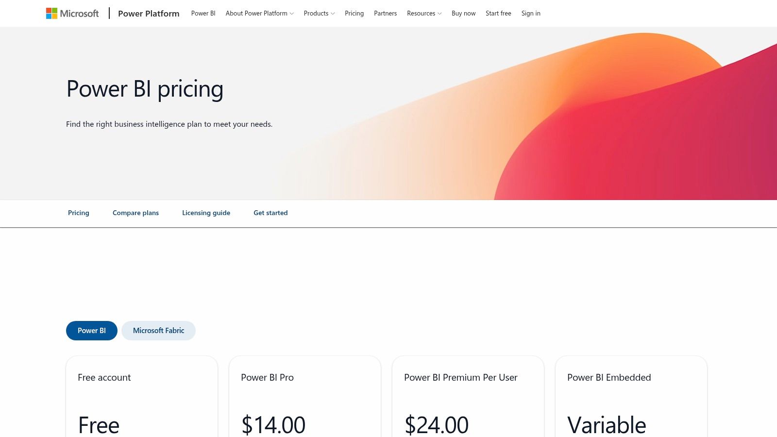
A regional director opens the dashboard before the Monday exec meeting. Finance wants margin by business unit. Operations wants backlog and SLA risk. Sales wants forecast accuracy. IT wants row-level permissions and an audit trail. That is the environment Power BI is built for, and Microsoft's Power BI stack is usually the practical choice when those requirements are real.
This example belongs in the list because it shows a different design job than a marketing or wallboard dashboard. The goal is not just to surface KPIs quickly. The goal is to give each audience the right level of visibility without breaking governance, creating metric disputes, or turning one report into a political battleground.
Why the layout works
The strongest enterprise dashboards use a layered structure. The first view gives leadership a small set of business health indicators. Below that, managers can drill into region, team, product line, or cost center. Operators get exception views, filters, and record-level detail in separate tabs or linked reports.
That structure sounds obvious. Teams still get it wrong all the time.
A single page that tries to satisfy the CFO, the VP of Sales, and a frontline supervisor usually fails all three. Executives need trend direction and forecast risk. Managers need variance by segment. Operators need a queue they can act on today. Treat those as separate use cases, even when they live inside the same BI environment.
A good blueprint here usually includes:
- Executive layer: Revenue, margin, forecast vs. plan, major risk flags, and a few cross-functional trends
- Management layer: Department or regional drill-downs, target attainment, conversion or throughput rates, and variance analysis
- Operational layer: Exceptions, aging items, SLA breaches, workflow bottlenecks, and owner-level accountability
- Governance layer: Clear metric definitions, permission control, refresh status, and source ownership
What to include
Enterprise dashboards work best when they combine financial, operational, and planning metrics in one reporting model, but not all on one page. For leadership, I would keep the top section narrow: revenue, gross margin, operating cost trend, forecast confidence, and a short list of outliers that need attention. For managers, add the dimensions that explain performance: geography, team, channel, product category, or customer segment.
If the business is also shipping AI products or internal models, BI and model oversight start to overlap. The same leadership team that reviews revenue and service performance may also need to monitor your AI models for drift, failed predictions, or unexplained output changes. In practice, that means deciding early which signals belong in BI, which belong in product monitoring, and who owns the response when something moves outside tolerance.
The pitfall to avoid
Power BI can handle a huge amount of complexity. The common mistake is treating that flexibility as permission to keep adding tabs, visuals, and stakeholder requests until the dashboard becomes a reporting warehouse with no clear decision path.
The fix is discipline. Define the audience first. Lock the business definitions before building visuals. Separate summary views from investigation views. If governance is a primary requirement, Power BI is a strong fit. If the team only needs a fast weekly KPI board, this category can add setup overhead, licensing confusion, and maintenance work that never pays back.
7 Performance Dashboard Examples Compared
A good dashboard choice comes down to operating model, not feature count. A freelancer trying to win more Upwork work needs proposal and reply metrics. An agency owner needs margin, utilization, and client reporting speed. A VP in a Microsoft-heavy company needs governance, permissions, and a reporting standard the whole business can live with.
That is the useful way to compare these examples. Not as a gallery, but as design blueprints with different jobs.
The Upwork Analytics Dashboard
- Implementation complexity: Medium, onboarding, profile tuning, and demo required
- Resource requirements: Moderate, paid subscription, multi-user setup, Success Agent support
- Expected outcomes: Direct revenue attribution, stronger reply visibility, faster proposal workflow
- Ideal use cases: Freelancers and agencies focused on Upwork outreach and scaling bids
- Key advantages: End-to-end Upwork automation, niche funnel metrics tied to platform performance
The Live TV & Team Motivation Dashboard (Geckoboard)
- Implementation complexity: Low, fast setup for wallboards
- Resource requirements: Low, simple connectors, TV and Slack sharing, pricing scales by editors and dashboards
- Expected outcomes: Real-time team visibility and immediate KPI awareness
- Ideal use cases: Ops, sales, and support teams that need live leaderboards and wallboards
- Key advantages: Fast deployment, easy sharing, clear use case for in-office performance visibility
The Client-Ready Marketing & Sales Dashboard (Databox)
- Implementation complexity: Low to Medium, template deployment and minor customization
- Resource requirements: Moderate, subscription tiers, many integrations, team-friendly pricing
- Expected outcomes: Faster client reporting and automated KPI delivery
- Ideal use cases: Agencies managing multiple clients and recurring marketing reports
- Key advantages: Large template library, polished client-facing layouts, no per-seat fees on some plans
The Customizable Agency Operations Dashboard (Klipfolio)
- Implementation complexity: Medium to High, steeper learning curve for granular control
- Resource requirements: Moderate, wide connector set, may need skilled users and add-ons
- Expected outcomes: Deeper operational and financial insight through custom visualizations
- Ideal use cases: Agencies needing custom ops, project profitability, and resource dashboards
- Key advantages: Fine control over visuals and logic, interactive demos and templates
The Google Ecosystem Performance Dashboard (Looker Studio)
- Implementation complexity: Low, one-click templates, complexity grows with BigQuery use
- Resource requirements: Low to Moderate, free tier, paid connectors and BigQuery costs at scale
- Expected outcomes: Google-data reporting with low entry cost for marketing teams
- Ideal use cases: Teams heavily using GA4, Google Ads, and BigQuery
- Key advantages: Native Google connectors, free entry point, broad template ecosystem
The Data Storytelling & Inspiration Dashboard (Tableau Public)
- Implementation complexity: Variable, easy to explore examples, advanced workbooks need Tableau skills
- Resource requirements: Low for public use to High for private or enterprise licensing
- Expected outcomes: Strong design inspiration and prototyping support
- Ideal use cases: Designers and analysts seeking visualization patterns and learning assets
- Key advantages: High-quality storytelling examples and downloadable workbooks for learning
The Enterprise & BI Integration Dashboard (Power BI)
- Implementation complexity: Medium to High, enterprise deployment, governance and best-practice setup
- Resource requirements: High, licensing complexity, deeper Microsoft and Azure integration may require capacity
- Expected outcomes: Standardized BI reporting, stronger governance, faster rollout across teams
- Ideal use cases: Organizations standardized on Microsoft 365, Fabric, or large-scale BI needs
- Key advantages: Strong Microsoft integration, template apps, and governance controls
A few trade-offs matter more than the feature list.
Upwork Analytics is narrow by design, and that is its strength. It works best when the team needs platform-specific performance signals, not a general business dashboard. Geckoboard sits at the other end. It wins on speed and visibility, but it is usually a front-line scoreboard, not the place to run multi-layer analysis.
Databox and Klipfolio are often compared by agencies evaluating client reporting. In practice, they serve different levels of control. Databox is the faster option when the goal is repeatable client-facing reporting with less setup friction. Klipfolio is the stronger fit when operations leaders need to define their own formulas, combine service delivery with finance data, and build dashboards around how the agency operates.
Looker Studio remains the practical choice for Google-heavy reporting stacks. The catch is that teams often outgrow the simple version once they need cleaner joins, stricter definitions, or stable reporting across many accounts. Tableau Public is less about production reporting and more about learning what strong visual communication looks like. That makes it useful early in dashboard design, before a team locks itself into weak chart choices.
Power BI is the highest-commitment option in this group. It earns that overhead when reporting standards, permissions, and enterprise data control matter enough to justify setup time.
If I were choosing quickly, I would use this rule. Pick the tool that matches the decision cadence. Live coaching and team energy point to Geckoboard. Monthly client reporting points to Databox. Agency operations management points to Klipfolio. Enterprise governance points to Power BI.
Beyond the Charts Build Your Dashboard with Purpose
Monday morning. The leadership team is in the room, the dashboard is on the screen, and everyone can see the numbers. The problem is that nobody agrees on what to do next. That is usually the main failure point. A dashboard can look polished and still be useless if it does not support a specific decision.
The strongest examples in this list worked because each one was built for a job, not for display. The Upwork view supports pipeline decisions. The live TV dashboard drives pace and accountability on the floor. The client-ready reporting dashboard helps an agency explain results without sending clients into a metric rabbit hole. That is the standard to use when building your own. Start with the decision, then choose the layout and metrics that help someone make it well.
A practical rule I use is simple. If a metric does not change someone's next action, it probably does not deserve homepage placement. Teams often overload dashboards with activity metrics, then wonder why meetings drift into interpretation fights. A tighter dashboard usually performs better. Keep the leading indicators focused, tie them to one operating goal, and make ownership obvious.
Context matters just as much as visibility. A real-time number can prompt action, but trend lines show whether the team is improving or just reacting. Harvard Kennedy School's guidance on five elements to include in every performance dashboard makes that point well. Historical views help leaders spot seasonality, separate noise from pattern, and judge whether a change proved effective.
The same design logic shows up outside agency and SaaS reporting. In one construction example, a safety dashboard gave managers a live view of incidents and compliance gaps, then supported targeted operational changes rather than generic reminders, as described in this review of safety performance dashboard case studies. In retail, a business dashboard that brought sales, inventory, and customer engagement into one view helped store teams react faster to demand shifts, according to this case study on successful business dashboards in action. Different functions, same blueprint. Show the right signals, add enough context to interpret them, and make the next step clear.
One mistake shows up in almost every weak build. Teams treat the dashboard as the final product. In practice, the dashboard is part of an operating system. It needs targets, review cadence, owners, and a clear response when a number moves out of range. Without that, the charts get checked, discussed, and ignored.
Start narrower than you think. Pick one operating problem. Choose the few metrics that explain it. Add targets, trend context, and a named owner for each measure. Then adjust after two or three review cycles based on how people use it.
That is what separates a good-looking dashboard from one that improves performance.
If Upwork is a serious growth channel for your agency, Earlybird AI is worth a close look. It combines automation and analytics in one system, so you can see which proposals, replies, and follow-ups turn into calls and revenue, then act on that data fast. For teams that want less manual bidding and a clearer path from outreach to won work, it's one of the most practical tools in this lineup.