
← Back To Blog
UX Design Proposal Template to Win More Clients in 2026
You've probably done this already. You find a solid Upwork job, spend an hour shaping a careful proposal, attach a few polished screenshots, hit send, and then get nothing back.
The silence usually isn't about your UX skills. It's about the proposal reading like a service menu instead of a buying document. Clients don't ignore proposals because they hate wireframes or user flows. They ignore them because the proposal doesn't help them make a decision.
A strong UX design proposal template fixes that. It gives you a repeatable structure for framing the client's problem, showing how you'll reduce uncertainty, and making the next step feel easy. The best ones aren't static either. They flex for small audits, feature redesigns, and large product engagements without turning into a bloated PDF nobody reads.
On competitive marketplaces, speed matters too. A good template helps you respond fast. A better system combines that template with personalized outreach and disciplined follow-up so you're not rebuilding your sales process from scratch every time.
Why Your Current Proposals Are Getting Ignored
Most ignored proposals fail in the first screenful.
They open with designer-centered language like “I'm a passionate UX/UI specialist with 8 years of experience” and then jump straight into deliverables. The client posted because something isn't working in their product, onboarding, checkout, internal workflow, or conversion path. If your opening doesn't name that problem in their language, you've already made them work too hard.
I've seen the same pattern again and again on freelance platforms. A client asks for help with a confusing signup flow, and the proposal replies with a list of tools: Figma, FigJam, prototyping, responsive design, design systems. None of that is wrong. It's just premature. They aren't buying tools. They're buying clarity, lower risk, and movement.
What clients actually react to
Clients open and reply when the proposal does three things quickly:
- Shows understanding: It reflects the problem back in plain language the client already used.
- Reduces ambiguity: It explains how discovery, decisions, and approvals will work.
- Connects UX to business impact: It ties design work to measurable outcomes instead of taste.
A generic proposal says, “I can redesign your app screens.”
A stronger one says, “Your team needs to identify where users stall in onboarding, validate a better flow with users, and move into design with fewer revision loops.”
Clients rarely hire the most detailed proposal. They hire the one that makes the project feel manageable.
What doesn't work anymore
A deliverable-only proposal creates three problems:
- It invites scope creep: If all you list is “wireframes, mockups, prototype,” the client has no idea how decisions get made.
- It frames you as production support: That pushes the conversation toward hourly rate shopping.
- It gives no decision logic: When feedback gets messy, there's nothing in the proposal to anchor trade-offs.
The fix isn't writing more. It's writing with a better structure. Your proposal should read like a business case with a UX execution plan attached.
The Anatomy of a Winning UX Proposal Template
A winning proposal usually has 12 to 15 sections, enough to cover scope, goals, delivery, and decision-making without leaving dangerous gaps. The strongest versions also keep stakeholder attention tight by surfacing only three to four key insights when presenting research direction or proposal logic, as noted in the verified guidance above.

Start with the client problem
The opening page should feel like a mirror.
A proposal must include a specific, concise problem statement tied to business objectives, and it should mirror the client's language to build trust, based on the Interaction Design Foundation guidance on design proposals. If the client says “trial users don't finish setup,” don't rewrite it as “suboptimal activation funnel friction.” Keep the original business pain visible.
Use a short structure like this:
- Current issue: What appears to be broken or unclear
- Business consequence: What that likely affects
- Proposed response: How UX work will reduce uncertainty
Example copy:
Your team needs a clearer onboarding experience because new users are dropping off before they reach first value. My recommendation is to validate the highest-friction steps first, then redesign the flow around completion, comprehension, and handoff to engineering.
Define success before deliverables
Many proposals stay weak. They describe outputs but never define what success looks like.
A strong UX design proposal template explicitly names measurable success metrics and baseline measurements before changes are made. That can include task completion rates, time on task, error rates, and user satisfaction scores such as NPS, CSAT, or SUS, then compare old versus new designs through A/B testing when appropriate. It should also state how post-launch analytics will be monitored so optimization is driven by data, not assumptions.
That section can be brief, but it needs to be concrete.
- Behavior metrics: task completion, drop-off points, error patterns
- Efficiency metrics: time on task, path length, support dependency
- Perception metrics: SUS, CSAT, NPS, or direct user confidence feedback
If the project is form-heavy, that's also a good place to reference specialized resources like these actionable form design tips from Orbit AI, especially when the client's conversion issue lives inside signups, checkout, intake, or multi-step flows.
Put discovery on rails
The best template doesn't treat research like a vague pre-phase. It makes discovery operational.
A robust proposal should codify a six-phase discovery methodology to control scope: stakeholder interviews, analytics review, competitor analysis, technical constraints review, existing research audits, and explicit business goals alignment. That structure matters because scope creep accounts for 30 to 50% of project budget overruns, according to the verified source from Growlio's UX proposal template reference.
That discovery section should also state how research will be run:
- Stakeholder interviews: clarify business goals, constraints, and approvals
- Analytics review: identify friction points and current user behavior
- Competitor analysis: map market expectations and common patterns
- Usability testing: define participant count and tasks to observe
- Survey work: use when demographic or broad preference input is needed
- Documentation plan: explain how findings will be presented for decisions
Be explicit about recruitment too. If usability testing is included, state the exact participant range, such as 5 to 10 users. If a survey is included, state that it may require 100+ participants. Clients trust research more when they can see the practical mechanics.
Clarify deliverables and what is not included
Vague deliverables produce endless review cycles. The proposal should specify technical outputs such as low-to-mid fidelity wireframes, interaction patterns, responsive behavior notes, clickable prototypes, and what decision each artifact supports.
Practical rule: Mid-fidelity wireframes should settle structure and interaction before anyone argues about polish.
The proposal should also include an explicit out-of-scope section. This matters more than most designers think. It protects margin, sets client expectations, and prevents “while you're in there” requests from becoming invisible labor.
Use relative timelines and a real investment section
Timelines should be milestone-based and tied to client feedback, not a fantasy calendar. Best practice is to use relative timing like “2 weeks after approval of wireframes,” and to note that feedback delays beyond 48 hours extend the schedule. That keeps the timeline honest without turning your process into a hostage situation.
Your investment section should be plain English. Break down what the client is paying for, list assumptions, revision terms, and payment structure. Don't hide behind vague package names with no explanation.
A strong close includes:
- Why me: why you care about this problem and why your experience fits it
- One relevant artifact: attach exactly one proof piece, not a gallery dump
- Next steps: give a choice-based CTA, such as a discovery call or a scoped workshop
That's the difference between a document that explains work and one that helps a client buy.
Crafting Your Upwork Cover Letter to Get Noticed
Your full proposal won't matter if the client never opens it. The cover letter does one job. It earns the click.

Most Upwork cover letters fail because they sound interchangeable. “Hi, I'm interested in your project and I'd love to help” could be sent to any client in any category. The fastest way to stand out is to prove you read the post.
A winning proposal needs a problem statement tied directly to the client's business objectives, and mirroring the client's language builds immediate trust, as noted in the earlier verified guidance from the Interaction Design Foundation. Your first two sentences should do exactly that.
A simple opener that works
Use this formula:
- Reflect the problem in the client's own terms.
- Add one useful observation, risk, or decision point.
For example:
- “You don't just need cleaner screens. You need to figure out why users abandon the onboarding flow before they complete setup.”
- “If the issue is happening between account creation and first action, I'd start by reviewing the existing analytics before redesigning anything.”
That sounds like a working UX partner, not a bidder.
Three cover letter patterns
For a vague job post
When the client says they need a “UX designer for SaaS improvements,” don't pretend the scope is clear.
- Lead with what's missing.
- Name the likely decision path.
- Ask one useful question.
Example:
You're likely choosing between a quick interface cleanup and a deeper flow diagnosis. Those lead to very different scopes. If you already have analytics or user session data, I'd use that first to isolate the highest-friction path before proposing screens.
For a clearly scoped redesign
Brevity is helpful here.
- Restate the goal
- Show process confidence
- Offer a concrete next step
Example:
Your checkout redesign needs to reduce friction without creating engineering churn. I'd map the current path, identify where users hesitate or error, and validate revised wireframes before visual polish. If helpful, I can send a one-page scope outline after reviewing the current flow.
For a higher-value client
Enterprise or mature startup clients care about risk management. Your opener should sound organized.
- Mention stakeholders
- Mention validation
- Mention decision cadence
If your profile itself needs work, study examples of designing a professional portfolio from MeshBase so the client sees the same level of clarity on your profile that they see in your outreach.
Keep the rest lean
Don't paste your entire methodology into the message. The cover letter should create curiosity, not finish the sale.
Use a compact structure:
- Opening insight
- Relevant fit
- Attached proposal or next step
- One direct question
A useful reference for tightening that first message is this guide to Upwork cover letter proposals.
A quick walkthrough can also help if you want to compare your approach against a live example.
A cover letter should sound like the first minute of a smart kickoff call.
Example Proposals for Different Project Scopes
One of the biggest mistakes in a UX design proposal template is pretending every project needs the same level of process.
That's how proposals get bloated for small jobs and dangerously vague for large ones. Research shows 68% of UX projects fail due to scope misalignment and insufficient user validation, and many templates make that worse by listing “research” as a generic phase without real feedback loops or data-triggered scope adjustments, according to the verified source from this UX proposal guide on Dev.to.
Small scope project
A small project might be a UX audit, one critical user flow, or a single-page redesign.
The proposal should stay lean. The client usually wants diagnosis, priority, and a realistic next step. You don't need to include every workshop format you've ever run. You do need to explain what you'll review, what the client gets, and what decisions the work will support.
A practical small-scope proposal usually emphasizes:
- Fast discovery: brief stakeholder input and analytics review
- Tight deliverables: annotated audit, revised wireframes, short findings summary
- Limited revisions: one focused review cycle tied to the agreed page or flow
It's common for many freelancers to oversell process. If the client needs clarity on one funnel leak, don't package it like a product transformation.
Medium scope project
A medium project often means a feature redesign, onboarding flow, dashboard section, or multi-step form experience.
Here the proposal needs a stronger research and validation spine. You're no longer just diagnosing. You're making interaction decisions that may affect multiple states, roles, and edge cases. The proposal should show where user input enters the process and what triggers iteration.
That kind of proposal usually includes:
- A clearer discovery phase
- Mid-fidelity wireframes before visual design
- A clickable prototype for key paths
- Usability testing before final refinement
- Handoff notes for engineering
On medium engagements, the client usually isn't buying screens. They're buying a safer sequence of decisions.
Large scope project
A large project could be a new product, major platform redesign, or multi-phase engagement with several stakeholders.
This proposal should not promise final certainty upfront. It should create a structure for moving from ambiguity to validated scope. That means phased approvals, explicit assumptions, and room to renegotiate scope when research reveals something material.
The large-scope version of your template should account for:
- Multiple stakeholder groups: product, marketing, support, leadership, engineering
- Discovery depth: business goals, constraints, current data, prior research, and market context
- Phased delivery: research, structure, prototyping, design refinement, handoff
- Change management: what happens if testing changes the direction of the solution
The difference across all three isn't just proposal length. It's decision density.
A small proposal helps the client buy an answer. A medium proposal helps them buy a validated direction. A large proposal helps them buy a process that can absorb uncertainty without collapsing into revision chaos.
Pricing Your Work and Negotiating with Confidence
If your proposal ends with an hourly rate and a rough estimate, you've made pricing the center of the conversation.
That's a weak position for UX work because clients can compare hours more easily than they can compare judgment. The stronger move is to price against business outcomes, decision risk, and scope complexity.
Verified data shows 74% of clients now prioritize outcome-based pricing, while many templates still default to hourly models. That gap leaves designers undervalued because proposals rarely include value-based pricing models or ROI projection thinking tied to client goals, based on the verified source from Qwilr's article on writing a UX design proposal.
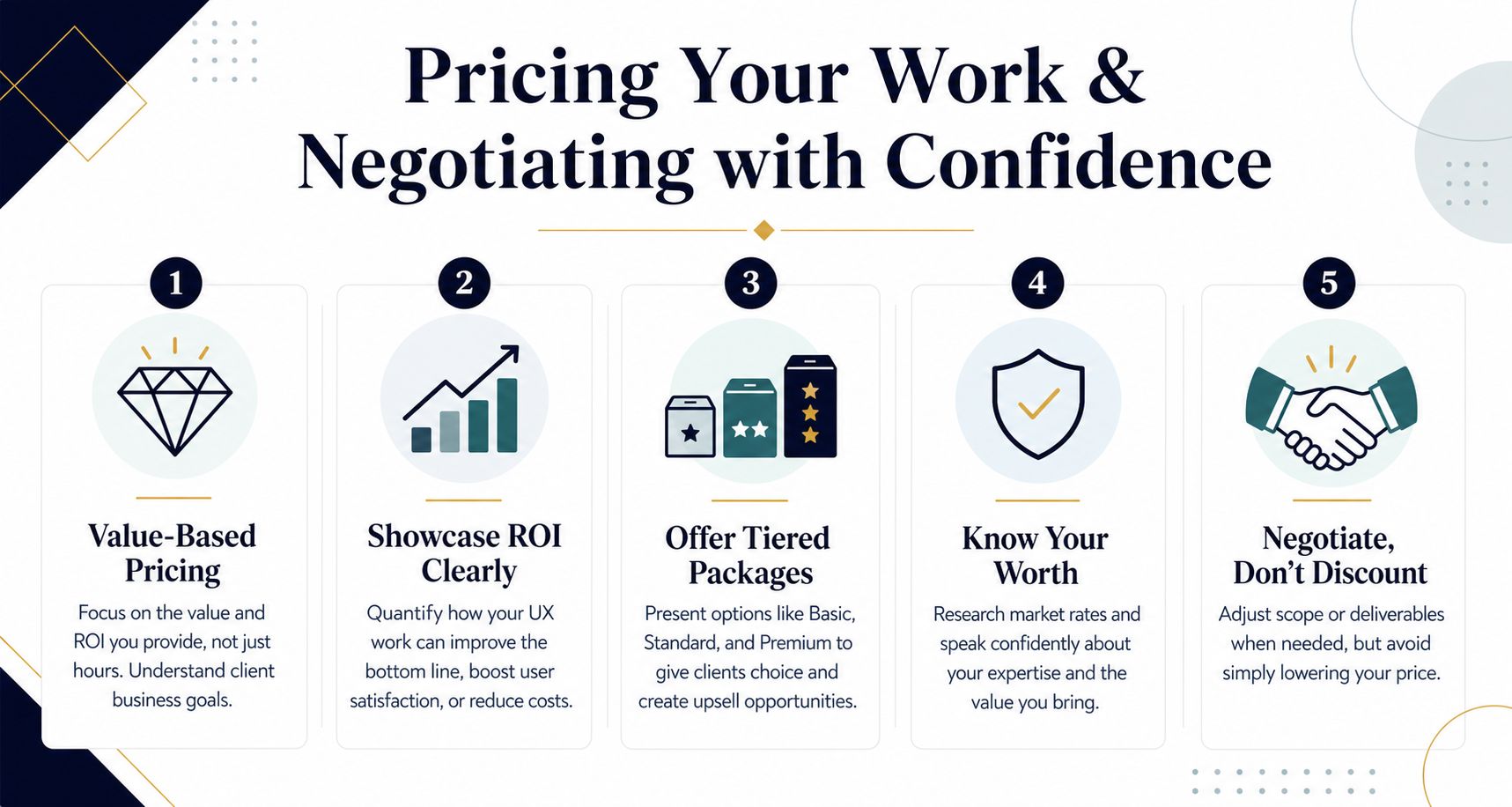
Price the decision, not the hours
Clients don't care how long Figma takes. They care whether the work reduces costly confusion.
That doesn't mean making inflated ROI promises. It means connecting your fee to what the project helps the client achieve. If the redesign supports activation, lead capture, internal efficiency, or support reduction, frame the engagement as an investment in that outcome.
A simple value-based structure might look like this:
- Diagnostic package: for clients who need clarity before committing to redesign
- Validation package: for clients who need research, wireframes, and prototype testing
- Execution package: for clients ready for a broader design and handoff phase
Use options without discounting yourself
Tiered packaging works because it gives the client control without forcing you into a race to the bottom.
Instead of lowering price when someone pushes back, adjust scope. Remove lower-priority pages. Split discovery from execution. Delay a prototype branch. Keep the value logic intact.
Phrases that help in negotiation:
- “I wouldn't recommend cutting the research step, but we can narrow it to the highest-risk flow.”
- “If budget is tighter right now, we can separate diagnosis from full redesign.”
- “I can reduce scope more easily than I can reduce the level of thinking needed to do this well.”
That last point matters. Discounting often creates a bad project, not a good compromise.
Make the investment section easy to buy
The investment section should be frictionless.
List what's included, what assumptions shape the price, how revisions work, and what would trigger a scope change. If you make clients decode your pricing, they'll either delay or compare you on the cheapest possible basis.
If you still use hourly pricing in some cases, use it carefully and anchor it with strategic context. This resource on how to set a winning Upwork hourly rate is useful when you need to position your number without sounding defensive.
Good negotiation keeps the project intact. Bad negotiation wins the client and loses the margin.
Automate Your Outreach to Win More Bids on Upwork
A strong proposal template solves quality. It doesn't solve consistency by itself.
On Upwork, timing changes everything. The freelancers who respond early with a personalized first message usually get more attention than the ones who craft the perfect proposal after the client has already shortlisted people. That doesn't mean sending robotic spam. It means building a workflow where the repetitive parts happen quickly and the strategic parts still get your judgment.

What should be automated
A lot of proposal work is pattern-based.
You probably reuse the same positioning for audits, onboarding redesigns, dashboard cleanup, app flows, and research-first engagements. You likely repeat the same follow-up rhythm too. Automation works well when it handles those repeatable layers while still leaving room for human edits.
The best parts to automate are:
- Job filtering: identifying work that matches your actual offer
- First-draft personalization: pulling in relevant project framing and proof points
- Follow-ups: staying visible after the initial proposal
- Message consistency: keeping tone and structure stable across outreach
The key is restraint. Automation should generate a good draft and preserve your voice, not flood the platform with generic filler.
Keep the human part where it matters
The proposal still needs judgment at the pressure points.
You should still decide whether the client needs a diagnostic offer or a full redesign proposal. You should still choose which proof asset to show. You should still rewrite the opening problem statement when the post is messy or contradictory.
The strongest automated workflows usually keep the output tight. The same principle used in strong UX research readouts applies here too. The most effective presentations limit key insights to three to four points, and proposals close better when they end with clear next steps and a choice-based call to action. That discipline matters even more when automation increases your volume.
A practical next step is to study examples of how teams automate Upwork proposals without stripping out personalization. The goal isn't more words. It's faster relevance.
The system that actually scales
The winning setup isn't “template versus personalization.” It's both.
You keep a modular UX design proposal template for small, medium, and large scopes. You pair it with a cover letter framework that opens with the client's problem. Then you automate the repetitive motion around job discovery, draft generation, and follow-up cadence so your energy stays focused on strategy, pricing, and closing.
That combination is what makes competitive bidding sustainable.
Earlybird AI helps freelancers and agencies turn that system into an always-on sales workflow. It finds matching Upwork jobs, drafts personalized proposals in your style, follows up quickly, and keeps outreach moving so you can spend more time on strategy and client work. If you want a faster way to apply your proposal process at scale, take a look at Earlybird AI.